 |
| Facebook with Navigational and Link Components |
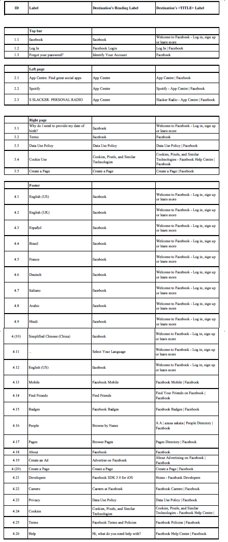 |
| Label Table for Facebook |
I was very annoyed with examining the labels of the Facebook home page. Most of the time with the footer, the labels were very miss leading, or made no sense.
Most of the footer labels would change their targeted audience after the user clicks it, or would lead to a page unrelated to what the label description is.
An example of this would be the label "Developers". It leads to a page with it's title being Facebook SDK 3.0 for iOS, yet the <title> tag says "Home - Facebook Developers". When I clicked this, I thought I'd find the details of the people who created Facebook. Instead I find a part of Facebook that is meant for developing apps for the Facebook or sites to link to Facebook.
The label could be a bit more descriptive like, "Developers Home Page" or "Developing App Centre", something that gives off where the link will take the user.
Another thing I did not like about the labels was there where doubles of links over the page. "English (US)" was used twice in the footer of the home page. Even now I still do not know why.
The a few of the labels linked to the exact same page as each other, yet each label described a different thing. For example, "Privacy" and "Data Use Policy" both link to the "Data Use Policy | Facebook" page. Why not just include them together? It makes less clutter on the website and makes it easier for a user to navigate with fewer options.
One annoying feature of the footer labels were all the language labels at the bottom. Now I know what the Facebook developers were trying to do because I'm use to the advanced understanding of the web. Although, other users who are not trained to understand this, would find it very confusing with all the different languages. They should be labelled in a descriptive way that says something like "For picking your language, click here", and have that put in a couple of different languages itself for quick understanding to a user.
One more thing I did not like with the footer labels, was one particular label itself. Even with my advanced knowledge, I could not figure out what the label "..." meant along with the language labels. I click on it and it shows a pop up with multiple languages to select. I mean what in the world! How does "..." mean "More languages to select"? Very confusing to a user, even with knowledge in website. Not only this, but I only spotted the label by accident when I was copying the home page to edit and put onto this blog.
Two competing sites popped into my head when I was asked to find sites that competed or resembled the same labelling information architecture as Facebook: Twitter and MySpace.

Twitter uses the same general information layout for it's home page like Facebook.
Header has the it's symbol that links to the twitter home page like Facebook has.
Left side of the site has a little bit of information about what the site is about while Facebook has navigation to apps relating to itself.
Right side of site has quick sign in features like Facebook as well.
Footer has similar labels to Facebook's footer labels.
Yet all of this, I can see Twitter has done a better job. The expansive labels for choosing your language was confusing and to crowded. Twitter has put the language in the top right part of the site with a label, "Language:" with a drop down arrow for choices of languages. Much easier to understand than Facebook. Also I could guess and understand where the footer's labels would lead me too. The "Developers" label still got me annoyed since it was still not descriptive enough, but all in all, I prefer Twitter's home page layout better than Facebook's. A lot easier to understand and handle.

MySpace has taken a different approach to Facebook and Twitter all together. It is trying to make an image for itself. It's header still uses the same approach as the other two social networking sites, but with a difference. Even though the Symbol sends the user to the home page, it adds other navigational labels for searching quickly through common topics being looked at (e.g. Such as Music, Video, Games, Browse People). It every has sign in squeezed up the top with a search bar.
The middle of the site is comprised of a number of images relating to chronological ordered items under the subjects mentioned before in the header (Music, Video, Games, Browse People). Just above the footer is a bunch of lists separated by topic.
The footer is crowded with more topic lists. Each label I clicked showed me exactly what I thought what page I would be taken too. Easy to understand the layout if given the time to look at all the information.
But is there a clear winner? I'd have to say a tie between Twitter and MySpace. While Twitter has the less crowded interface with easy navigation, MySpace has easy to understand, descriptive labels, making navigation a bit easier when doing known-item searching. If these could be implemented into one, this would be, in my opinion, the best social networking website ever implemented.
(Side Note: If anyone can tell me how to link a PDF file to a blog, it would be very helpful so people could see the Facebook label list clearly. Thank you.)
No comments:
Post a Comment